

How To Design a Mobile Friendly Website: 5 Tips for Better UX and SEO

Did you know that in 2025, more than 60% of all website traffic comes from mobile devices? If your website is not designed with mobile users in mind, you are not only frustrating visitors, but you are also losing valuable leads and search engine rankings. Google’s mobile-first indexing means that your site’s mobile version is the primary benchmark for SEO, user experience (UX), and overall performance.
Designing a mobile-friendly website is not just about shrinking your desktop layout to fit a smaller screen. It is about creating an experience that is fast, intuitive, and optimized for on-the-go users. From responsive design and simplified navigation to faster load speeds and touch-friendly elements, every aspect plays a role in ensuring your site works seamlessly across smartphones and tablets.
In this guide, we will share five practical tips for mobile website design that will help you improve usability, enhance your SEO, and ultimately convert more visitors into customers. Whether you are a business owner in Adelaide or managing a global brand, these strategies will keep your website competitive in today’s mobile-driven world.
Tips to Optimise Your Website for Mobile
1. Prioritize Responsive Design
Responsive design ensures your website automatically adapts to different screen sizes, whether it is viewed on a desktop, tablet, or smartphone. Instead of creating separate versions for each device, a responsive website layout adjusts content, images, and navigation for the best possible viewing experience.
With Google’s mobile-first indexing, responsive design is a ranking factor. If your website does not function well on mobile devices, you risk lower visibility in search results and higher bounce rates.
Here are key considerations for responsive website design:
-
Flexible Layouts
Use fluid grids and flexible images so your content can scale proportionally to different screen sizes. It ensures your website does not appear “broken” when accessed on smaller devices.
-
Mobile-First Approach
Design with mobile screens in mind before scaling up to desktop. It guarantees that the most important elements, such as your brand message, navigation, and calls-to-action, are clear and accessible on mobile.
-
Optimize Images and Media
Large images can slow down mobile performance. Use compressed images, scalable formats (SVGs), and lazy loading to improve speed without sacrificing quality.
-
Consistent User Experience
Responsive design maintains a uniform look and feel across devices. It helps build trust, since users know they can expect the same quality experience whether they are on a phone or desktop.
By prioritizing responsive design, you create a website that’s not only visually appealing but also SEO-friendly and user-focused, keeping visitors engaged longer and increasing the likelihood of conversions.
2. Simplify Navigation for Smaller Screens
Navigation refers to how easily users can move through your website to find the information they need.
On mobile devices, it becomes even more critical due to limited screen space and the fact that users typically browse with one hand. If visitors cannot find what they are looking for quickly, they are more likely to leave your site.
The goal is to make navigation simple, intuitive, and thumb-friendly so users can move smoothly through your content without frustration.
Here are some best practices for mobile navigation website design:
-
Use a Hamburger or Collapsible Menu
Traditional desktop menus with multiple links do not translate well on smaller screens. A hamburger menu (☰) keeps your navigation clean while still giving users access to important pages like Services, About, and Contact.
-
Keep the Menu Short and Focused
Highlight only your most important pages. Too many menu options can overwhelm users, so prioritize the essentials.
-
Make Buttons and Links Thumb-Friendly
Google recommends a minimum touch target size of 48×48 pixels. It ensures that users can easily tap buttons without accidentally clicking the wrong item.
-
Add a Sticky Header
A sticky navigation bar stays visible as users scroll, allowing visitors to jump between sections or return to the homepage without scrolling all the way up.
-
Use Icons and Visual Cues
Simple icons (like a phone for contact, or a shopping cart for checkout) can help users quickly identify key actions on your website.
By simplifying navigation, you not only create a smoother user experience (UX) but also encourage visitors to stay longer and take meaningful actions—whether that is booking a consultation or exploring your services.
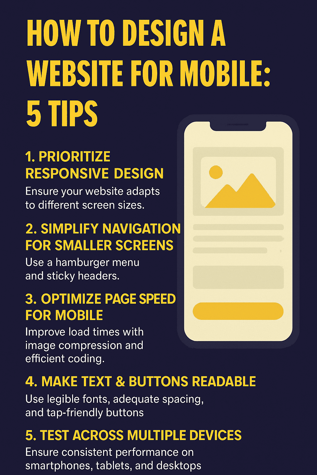
3. Optimize Page Speed for Mobile
Page speed is one of the most critical factors in mobile website design. Slow-loading websites frustrate users, increase bounce rates, and negatively impact search engine rankings. Research shows that if a page takes longer than 3 seconds to load, over 50% of mobile visitors leave immediately.
When designing for mobile, you need to ensure your website loads quickly without sacrificing quality or functionality.
Why Website Speed Matters?
-
User Experience (UX):
Fast websites keep users engaged longer.
-
Conversions:
A one-second delay in page response can reduce conversions by up to 7%.
-
SEO:
Google’s Core Web Vitals directly measure page loading speed, responsiveness, and visual stability.
Best Practices to Improve Mobile Page Speed
Image Optimization
- Compress images using modern formats like WebP.
- Apply lazy loading so images load only when they appear on screen.
Efficient Code
- Minify CSS, HTML, and JavaScript to reduce unnecessary data.
- Remove unused plugins and scripts that slow down the site.
Use Content Delivery Networks (CDNs)
- CDNs deliver content from servers closest to the user, improving load times globally.
Enable Browser Caching
- Store resources locally on users’ devices so returning visitors experience faster load times.
Mobile Hosting Considerations
Choose a hosting provider with strong mobile performance support, including HTTP/2 and optimized servers.
Testing Tools
Regularly check performance with tools like:
- Google PageSpeed Insights
- GTmetrix
- Lighthouse Reports
By prioritizing mobile page speed, you improve both user satisfaction and search engine rankings, giving your website a competitive edge in today’s mobile-first world.
4. Make Text & Buttons Readable
Readability on mobile devices is all about how text and interactive elements like buttons appear and function on smaller screens. If users struggle to read content or tap buttons, they are more likely to abandon your site.
Text Readability
-
Font Size
Small fonts can make reading difficult on mobile. A minimum of 16px is recommended for body text to ensure legibility without zooming.
-
Line Spacing
Sufficient spacing between lines (1.5x font size) prevents text from appearing cramped and improves overall readability.
-
Contrast
Ensure high color contrast between text and background. Following WCAG guidelines, aim for a contrast ratio of at least 4.5:1 for body text.
-
Content Structure
- Use headings (H1, H2, H3) to break up content.
- Keep paragraphs short (2–3 sentences).
- Use bullet points or numbered lists for scannability.
Button Design
-
Button Types
Primary Buttons (Contained):
Bold, filled buttons for important actions like Buy Now or Contact Us.
Secondary Buttons (Outlined/Text):
Minimal styles for less critical actions, such as Learn More.
Toggle Buttons:
Useful for switching between options (e.g., On/Off).
-
Button Size
According to the Web Content Accessibility Guidelines (WCAG), touch targets should be at least 48×48 pixels (or roughly 9x9mm). This accounts for the average human finger pad size, reducing misclicks.
-
Button Placement
Place key buttons where users naturally interact with the screen. For mobile, the bottom of the viewport is ideal since thumbs naturally rest there. Using the Gutenberg Principle (Z-pattern scanning) can also guide attention to CTAs at the end of a reading flow.
By making text and buttons easy to read and interact with, you can improve user experience (UX) and encourage more users to complete desired actions such as filling out a form, subscribing, or making a purchase.
5. Test Across Multiple Devices
Even with responsive design, simplified navigation, fast loading speeds, and readable elements, your website must be tested on real devices and browsers to ensure consistent performance. Users access websites through a wide variety of smartphones, tablets, and operating systems, and what looks perfect on one device may appear broken on another.
Why Testing Your Website on Multiple Devices is Important?
-
Consistency:
Testing guarantees that branding, layout, and features look the same across platforms.
-
Usability:
It identifies issues with navigation, font sizing, or button placement.
-
SEO:
Google evaluates mobile usability as part of its ranking algorithm. A poorly optimized mobile experience can reduce search visibility.
Device Testing Methods
-
Physical Device Testing
The most reliable method is checking your site directly on multiple devices (iOS, Android, tablets). It ensures real-world accuracy for responsiveness and usability.
-
Emulators and Simulators
Chrome DevTools:
Built-in browser tool to simulate screen sizes.
Xcode Simulator / Android Emulator:
Replicates device behavior for mobile app/web testing.
-
Cross-Browser Testing Tools
Platforms like BrowserStack and LambdaTest allow you to preview your website on hundreds of devices and browsers without needing the physical hardware.
Key Areas to Test
-
Loading Speed:
Ensure pages load within 3 seconds on 4G/5G connections.
-
Navigation:
Check if menus, CTAs, and forms work seamlessly.
-
Touch Responsiveness:
Buttons, sliders, and forms should be tap-friendly.
-
Layout:
Verify that text, images, and videos scale correctly without overlaps or cutoffs.
-
Continuous Monitoring
Mobile optimization is not a one-time task. As new devices and browser updates roll out, periodic testing ensures your website stays functional and user-friendly.
By conducting thorough multi-device testing, you safeguard your website’s user experience (UX), SEO performance, and conversion rates—making sure every visitor enjoys a seamless journey no matter what device they use.
Conclusion
Designing a website for mobile is a necessity to compete. With the majority of users browsing on their smartphones, a mobile-friendly design directly impacts your user experience (UX), search engine rankings, and conversion rates. By focusing on responsive design, simplified navigation, fast load speeds, readable content, and thorough multi-device testing, you create a website that not only attracts visitors but also keeps them engaged.
The businesses that succeed in 2025 will be those that invest in mobile-first website development, ensuring that every visitor—no matter what device they are on—enjoys a seamless journey from landing page to conversion.
At 110 DigiTech, we specialize in building and redesigning websites that are not only visually stunning but also mobile-optimized and SEO-friendly. Whether you are launching a new project or refreshing your existing site, our team ensures your business stays ahead in Adelaide’s competitive digital landscape.
Ready to make your website mobile-friendly and start converting more visitors into leads?
Contact 110 DigiTech Today for a Free Consultation on Mobile-Friendly Website Design.


